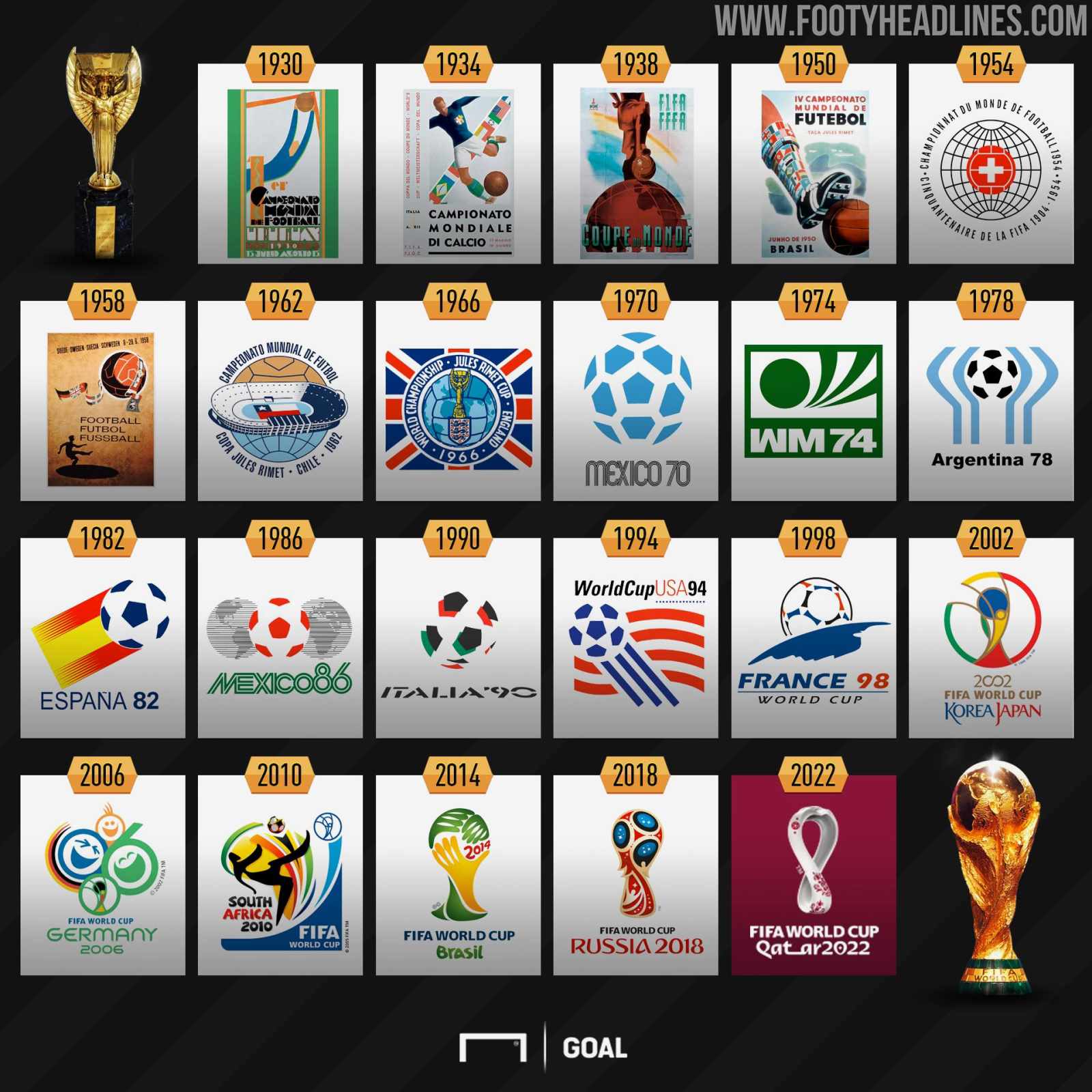
The Organizing Committee of the 2026 World Cup and FIFA presented the logo and identity of the tournament, which will be held in three years in the USA, Canada and Mexico.
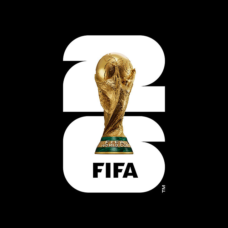
FIFA explained the idea of the logo as follows: the logo represents the World Cup, placed against the background of the numbers 26. It has a minimalistic and non-standard design. The description of the logo indicates its timeless approach, combining the image of the FIFA World Cup trophy and the year of the tournament.
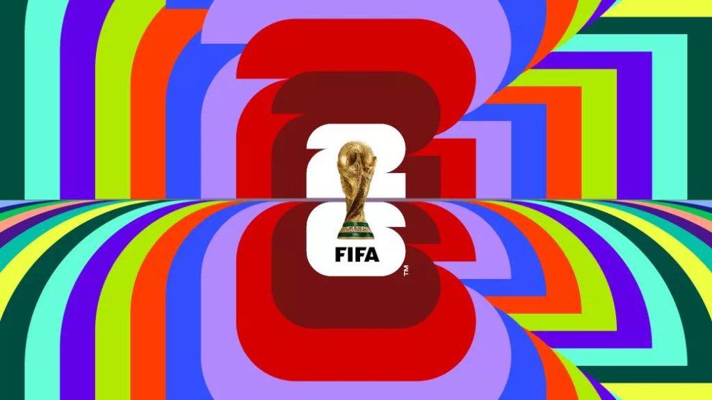
The official brand of the tournament is also presented in different colors, and it is described as a symbol of football celebration and diversity.
«For the first time in history, the logo depicts the trophy itself and the year of the tournament, which forms an innovative design language that anchors the World Cup logo for 2026 and beyond. The image of the trophy and the year of the event make it possible to use it in such a way as to reflect the uniqueness of each new tournament, while simultaneously creating a recognizable brand structure for many years to come,» the FIFA official website says.
Simultaneously with the appearance of the new logo, FIFA and the organizing committee are launching the We Are 26 («We are 26») campaign. As part of the campaign, there will be stories about the places where the World Cup will be held.
«We are 26» is a rallying cry, explained FIFA President Gianni Infantino. – This is the moment when three countries and an entire continent collectively declare: «We have joined together to organize the best, largest and most inclusive World Cup in history.»
An interesting detail is that in the official naming of the tournament, FIFA also abandoned the full use of the year, leaving only the numbers 26.